Create a reusable 3D SwiftUI button style with a pressed state
Learn how to make your buttons shine with custom button styles in SwiftUI
SwiftUI comes with a ButtonStyle protocol, which can be used to define custom styles for a button. Here's how you define a button with the default style:
Button("Hello SwiftyUI!") {
  self.sendLove()
}
which looks something like this on iOS:

ButtonStyle to the rescue!
Let's make a cool looking 3D button with a cool animation on pressing it. To begin, create a new file and name it CustomButtonStyle.swift and add the following code to it:
struct CustomButtonStyle: ButtonStyle {
    func makeBody(configuration: Configuration) -> some View {
        configuration.label
            .foregroundStyle(Color.blue)
    }
}
This code creates a base style for your buttons
Here, we are creating a new struct CustomButtonStyle which we conform to the ButtonStyle protocol. The ButtonStyle protocol requires us to implement the function makeBody(configuration: Configuration) where we define how our button would look like.
To use this style, add a modifier to your button like so:
Button("Hello SwiftyUI!") {
  self.sendLove()
}
.buttonStyle(CustomButtonStyle())
Let's add some 3D magic
So far we've created a basic button style which looks similar to the default style that SwiftUI gives us.
Now, let's talk about the Configuration struct that we receive as a parameter in the makeBody function. The Configuration struct, an alias of ButtonStyleConfiguration, provides two properties:
label- a View containing the label/title of the buttonisPressed- a bool that returns true when you're pressing the button, and false otherwise
We're already using configuration.label to show the title of the button in our CustomButtonStyle. Now let's add some styles around the label to make it stand out more.
struct CustomButtonStyle: ButtonStyle {
    func makeBody(configuration: Configuration) -> some View {
        configuration.label
            .foregroundStyle(Color.white)
            .padding(16)
            .background {
                LinearGradient(
                    colors: [Color("ButtonLight"), Color("ButtonDark")],
                    startPoint: .topLeading,
                    endPoint: .bottomTrailing
                )
                .clipShape(RoundedRectangle(cornerRadius: 16))
            }
    }
}
The colors "ButtonLight" and "ButtonDark" are defined in the Asset Catalog
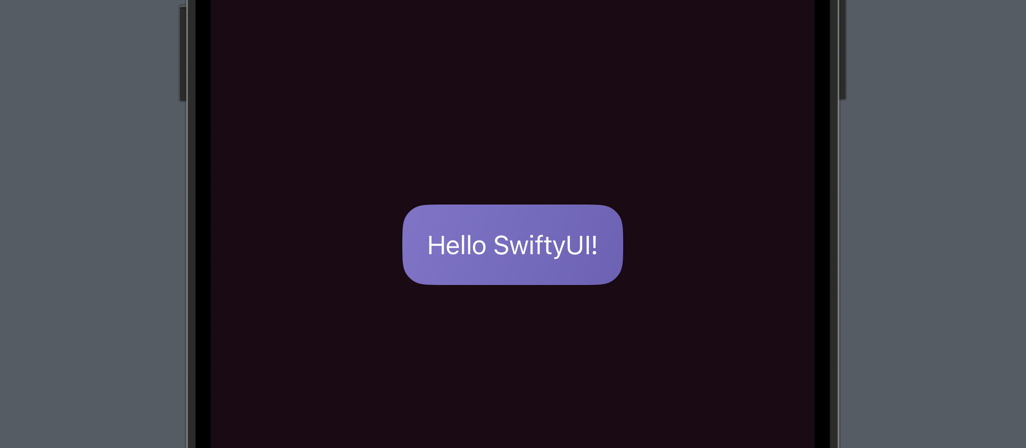
Okay so things are starting to look nicer, and the button finally looks like a button now! Let's rotate the button on x-axis and add another layer below it to simulate a 3D effect.
struct CustomButtonStyle: ButtonStyle {
    func makeBody(configuration: Configuration) -> some View {
        configuration.label
            .foregroundStyle(Color.white)
            .padding(16)
            .background {
                ZStack {
                    self.getBGView() // 1
                        .opacity(0.5)
                        .offset(y: 8) // 2
                        .padding(.horizontal, 2)

                    self.getBGView()
                }
            }
            .rotation3DEffect(.degrees(20), axis: (x: 1.0, y: 0.0, z: 0.0)) // 3
    }

    func getBGView() -> some View { // 1
        LinearGradient(
            colors: [Color("ButtonLight"), Color("ButtonDark")],
            startPoint: .topLeading,
            endPoint: .bottomTrailing
        )
        .clipShape(RoundedRectangle(cornerRadius: 16))
    }
}
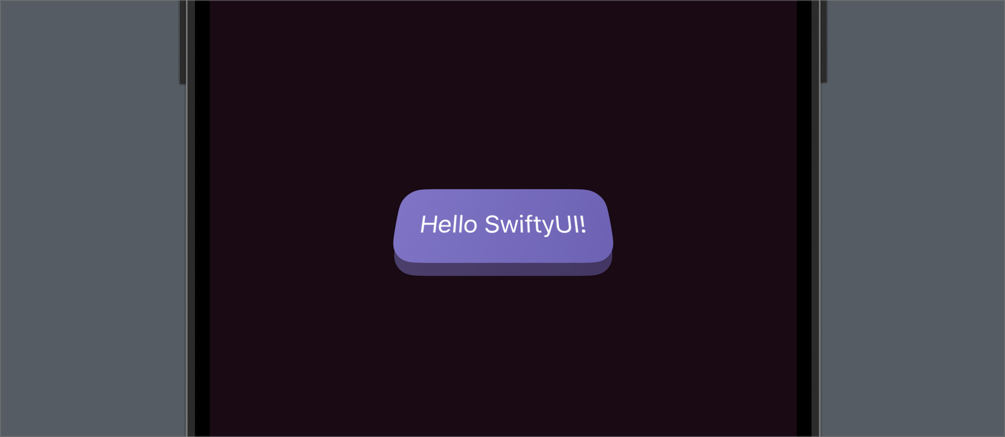
Here's a breakdown of the above code:
- First, we create a new function which returns the background of the button so that we can reuse it at multiple places
- Then, we add an offset to the bottom background layer to move it down a bit which gives an illusion of the 3D shape
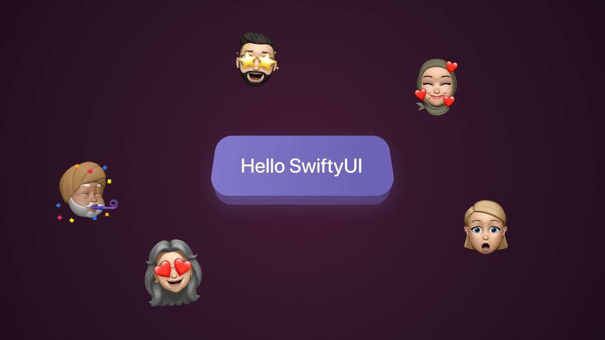
- Finally, we add a 3D rotation (20 degrees on the x-axis) to the whole button to give it some perspective
Here's the result:
Time for some animations
Now that our basic 3D shape is in place, we can animate the button when it's pressed to make the illusion feel more alive. To do that, we'll use the configuration.isPressed property and add some conditions based on it.
struct CustomButtonStyle: ButtonStyle {
    func makeBody(configuration: Configuration) -> some View {
        configuration.label
            .foregroundStyle(Color.white)
            .padding(16)
            .background {
                ZStack {
                    self.getBGView()
                        .opacity(0.5)
                        .offset(y: configuration.isPressed ? 0 : 8) // 1
                        .padding(.horizontal, 2)

                    self.getBGView()
                }
            }
            .rotation3DEffect(.degrees(20), axis: (x: 1.0, y: 0.0, z: 0.0))
            .offset(y: configuration.isPressed ? 8 : 0) // 2
            .animation(.interactiveSpring(), value: configuration.isPressed) // 3
    }

    func getBGView() -> some View {
        LinearGradient(
            colors: [Color("ButtonLight"), Color("ButtonDark")],
            startPoint: .topLeading,
            endPoint: .bottomTrailing
        )
        .clipShape(RoundedRectangle(cornerRadius: 16))
    }
}- First, we change the offset of the back layer and add a condition to it so that when the button is pressed, the offset becomes 0, otherwise it's 8
- Then, we add the same condition to the whole button but reverse it. Adding this moves our button down while also moving the background layer up. Try pressing the button without adding the offset here to see what's really going on
- Finally, we add the animation modifier to the button to make the state change animate smoothly.
.interactiveSpring()is perfect for interactions like this but you can use.easeOutoreaseInOutas well.
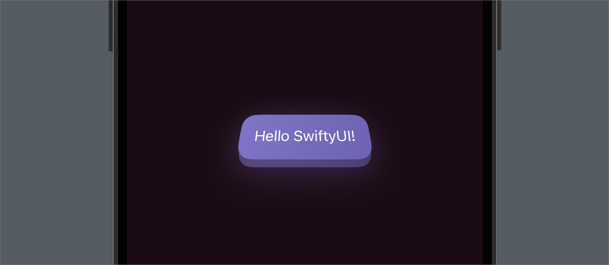
And here's the final result!
I also added a glow effect to give it more oomph but I'll let you figure that out.
Download the project and extras
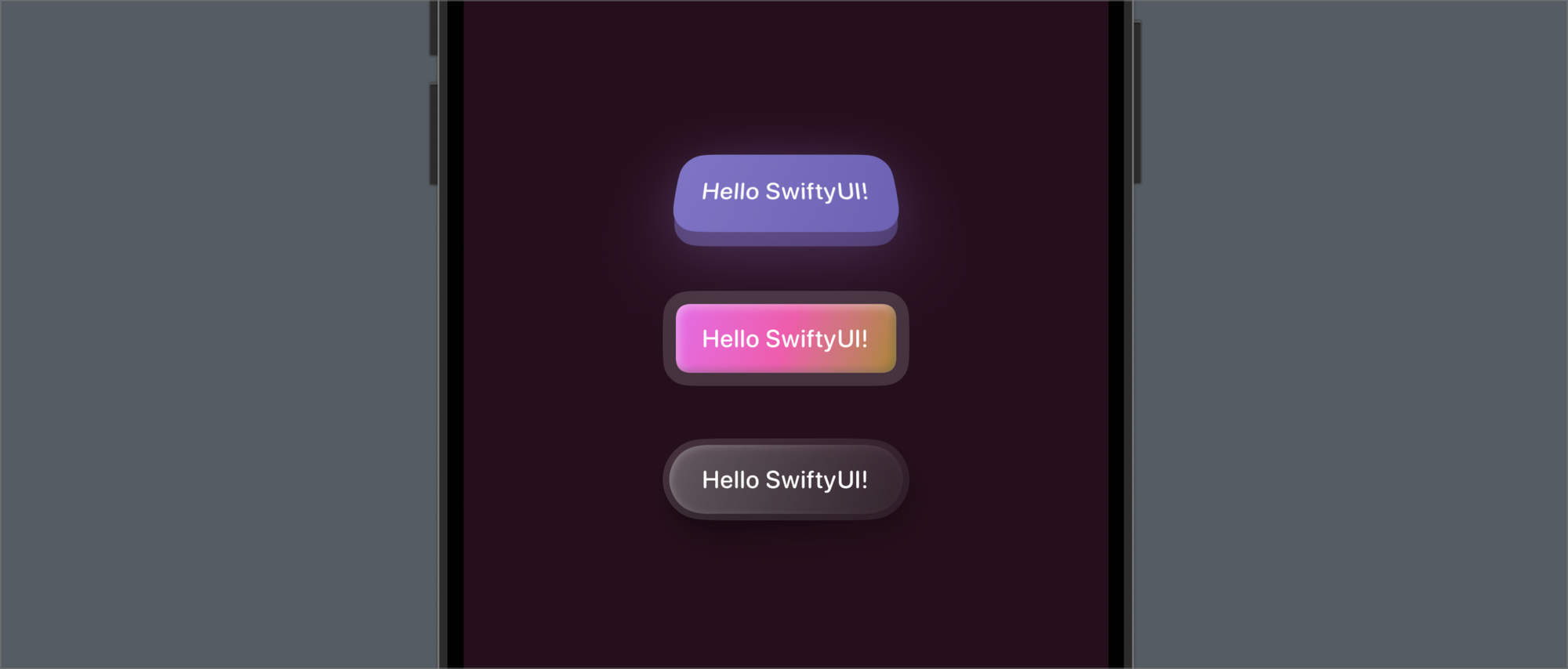
If you're a subscriber, you'll see a link to download the project file at the bottom of this article. It has the following button styles which you can directly use in your own apps. Hope you enjoyed the tutorial!
